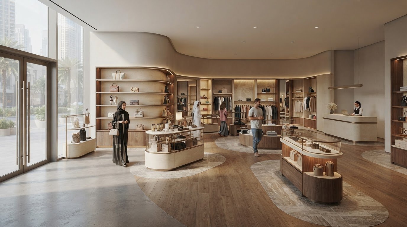

A store’s floor plan does more than arrange products: it determines where departments and fixtures sit and how merchandise and services are organised. Retail store layout and design typically draws on three approaches: grid, racetrack and free-form. Each shapes a different customer journey, from structured aisles to a guided loop or open browsing.
It is easy to focus on shelves and displays, but the routes between them matter just as much. A thoughtful layout helps customers find their way, gives key products room to stand out and makes the brand’s character clear from the moment they enter.
This guide explains how layout choices shape customer flow and brand storytelling, how entrances and pause zones influence first impressions, and how flexible displays can respond to changing products and promotions. It also covers practical planning factors, including store size, merchandise mix, circulation and checkout placement.
Key Takeaways
- Match the floor plan to the merchandise: grid layouts organise varied shelf-stocked goods, loops guide browsing, and free-flow plans suit more open exploration.
- Use circulation, displays and clear category landmarks to connect the shopping journey with the store’s brand story.
- Keep the entrance’s first 10-15 feet clear of key merchandise and signage so customers have room to adjust and take in the space.
- Choose movable displays to respond to changing products, promotions and customer shopping patterns without relying on a fixed arrangement.
- Shape the layout around store size, product mix, aisle comfort and checkout visibility, then assess how well customers find and move between products.
What Is a Retail Store Layout?
A retail store layout shows where departments, fixtures, merchandise and services are positioned on the sales floor. This arrangement influences how shoppers move, browse and read the store’s visual identity.
For UAE fit-outs, permit and building-code requirements vary by emirate, property and project scope. Include applicable approvals, life-safety provisions, building requirements and accessible circulation in the design plan.
Common Retail Layout Types
Grid, loop and free-flow layouts organise merchandise in different patterns, while boutique and hybrid plans adapt those patterns to a store’s needs. Grid layouts use repeated fixtures and long aisles, making them suitable for varied shelf-stocked goods such as groceries or hardware. They use floor space efficiently, though they can feel less exploratory.
A loop, also called racetrack, guides shoppers around a route past departments and displays. Free-flow and free-form plans use less rigid fixture placement, supporting relaxed browsing in boutiques with smaller inventories. Geometric layouts arrange fixtures in deliberate shapes; mixed layouts combine approaches, such as a grid around a free-flow feature area. Choose by merchandise range, browsing style and available square footage.
Feature Areas and Freestanding Displays
Feature areas give selected merchandise a distinct place in the layout, helping a new collection or seasonal offer attract attention. A freestanding display is a fixture or mannequin positioned along an aisle to draw shoppers towards a product or category. For example, a boutique can introduce a featured product on one central display, with related items placed nearby.
Display placement affects both visibility and circulation. A fixture can interrupt movement if it narrows a route, while a clear sightline helps shoppers see what lies beyond it. Keep the relationship between the display, surrounding merchandise and aisle easy to understand.
Layout choices work best when they reflect how shoppers browse and how products are organised. Grid plans suit stores with several shelf-stocked categories, including convenience stores and drugstores. Repeated fixtures create familiar aisles, often with staples at the back and impulse items near checkout.
A loop exposes shoppers to more departments along a guided route, so it can suit stores with broad assortments. Free-flow arrangements give shoppers more freedom to explore, but offer retailers less control over navigation. In a straight, or spine, plan, a main aisle directs movement, while merchandise at the front or sides may receive less attention.
Some terms describe a layout’s character rather than a separate floor-plan formula. Boutique layouts often use free-flow principles, while hybrid plans combine patterns to suit different departments. Geometric plans make fixture shapes part of the visual composition; mixed layouts can shift from organised aisles to open feature zones.
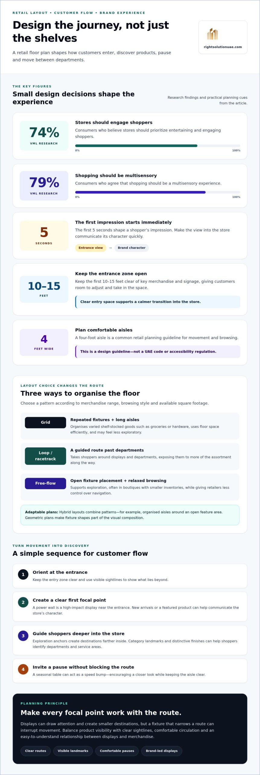
Displays add another layer to the plan. Displays can help draw attention to products and create smaller destinations within a store. Keep routes clear and leave comfortable aisle space. A four-foot aisle is a common retail planning guideline, not a UAE code requirement. The final arrangement should balance product visibility with easy movement.
Retail layout as customer-flow choreography and brand storytelling
A retail layout guides movement while expressing the brand through products, materials and atmosphere. In Dubai, a considered plan connects customer behaviour with product discovery and the experience the store aims to create.
Customer Flow and Product Discovery
Customer flow is the movement shoppers make between the entrance, merchandise, service points and checkout. A clear route helps people discover products without unnecessary backtracking, while leaving room to browse and pause.
Use category landmarks and visible sightlines to orient shoppers. A fashion store, for example, might place new arrivals where they can be seen from the entrance, then use signs or distinctive finishes to identify accessories and fitting areas. The first 5 seconds shape a shopper’s impression, so the view into the store should quickly communicate its character.
VML research found that 74% of consumers believe stores should prioritize entertaining and engaging shoppers. A route with varied displays and comfortable pause points can make exploration feel intentional, rather than turning the sales floor into a corridor.
Power Walls and Exploration Anchors
A power wall is a high-impact display near the entrance, while exploration anchors give shoppers destinations deeper inside the store. Both direct attention and create a sequence of visual moments.
A speed bump is a display or feature that encourages shoppers to slow down. For example, a seasonal table along a main route can invite a closer look without blocking the aisle. Large stores can use several anchors to give departments their own focal points, while a smaller boutique may rely on one strong feature area.
VML research found that 79% of consumers agree shopping should be a multisensory experience. Materials, lighting, colour and product presentation can contribute to that experience, provided they reinforce the brand rather than compete with merchandise.
Aisle Width and Accessibility Needs
Aisle width affects whether shoppers can browse, pass one another and reach merchandise comfortably. A common retail planning recommendation is to provide aisles at least four feet wide. Treat this as a design guideline, not a UAE accessibility regulation.
For accessible circulation, consider how a shopper using a mobility aid can enter, turn, reach products and approach service points. Keep routes clear of displays and temporary stock, and coordinate aisle dimensions and clearances with applicable local project requirements. A spacious route also supports families, shoppers carrying bags and busy periods.
Layout Mistakes and Safety Risks
Common mistakes include placing displays where they block sightlines, narrowing a route with promotional stock, and hiding service points behind tall fixtures. These choices can interrupt movement and make key areas harder to find.
Check that freestanding displays remain stable and don’t intrude into circulation paths. Avoid blind corners where shoppers cannot see approaching traffic, and keep checkout access clear. A coordinated interior and exterior fit-out can help translate circulation plans, finishes and customer-facing features into a cohesive retail space.
Entrance and decompression zones
The entrance creates a store’s first view, while the decompression zone gives shoppers room to adjust. This transition influences how customers take in the space, notice visual merchandising and begin browsing.
A decompression zone is typically the first 10-15 feet inside the entrance, depending on the store’s overall size. During this transition, customers adjust to the store’s lighting, scale and shopping environment. A compact Dubai boutique may need a shorter, carefully organised transition than a broad-format store, but both benefit from a clear route beyond the doorway.
Customers should understand what the store sells within ten seconds of entering. Make the category or brand identity immediately clear with a visible sign, a representative display or an unobstructed view of the sales floor. For example, a fashion retailer can show a coordinated outfit beyond the entrance instead of presenting an unclear mix of accessories and fixtures.
Keep important merchandise, signage and carts out of the decompression zone. Shoppers may overlook them while adjusting, so a promotional fixture directly inside the entrance can lose impact. Leave the initial area open, then position the first major display where it becomes visible as customers move into the store.
The entrance also influences how shoppers read the rest of the merchandising. A clear sightline can reveal a feature wall, main aisle or service point without crowding the threshold. In a narrow shop, fixtures along the side walls can preserve an open centre; in a wider store, a visible central route can show customers where to go next.
Visual merchandising should create a transition, not a barrier. Use a focused window display to communicate the store image and merchandise category before entry, then continue the story with a coordinated feature inside. If the window promotes a seasonal collection, the first interior display can carry through its colour palette or product theme without occupying the decompression area.
Plan the entrance as part of the whole customer journey. Map the doorway, clear transition zone, first display and onward route together, then review the plan from a shopper’s viewpoint. Someone entering with a bag or pausing to look around should still be able to move freely. This sequence helps the entrance communicate the offer while giving customers room to orient themselves.
Flexible layouts for changing products and promotions
Flexible planning lets retailers adjust displays as merchandise, seasons and customer patterns change. In Dubai, adaptable fixtures can support new campaigns without disrupting the store’s main circulation routes.
Flexible Layouts for Promotions
A flexible layout uses movable displays and adaptable zones to accommodate changing products and promotions. Unlike fixed fixtures, movable displays can shift as merchandising needs evolve. A retailer can introduce a seasonal feature, test its position and adjust it in response to customer feedback and shopping patterns.
Keep the primary route consistent while changing secondary displays. For example, a fashion store can refresh a central table for a new collection without moving fitting rooms or checkout. This keeps promotions current while preserving familiar navigation for returning shoppers.
Space Productivity and Category Allocation
Space productivity considers how floor area supports inventory, category needs and sales impact. Allocate space by reviewing each category’s role, display requirements and sales per linear foot. This gives retailers a practical basis for deciding which merchandise needs more frontage or shelving.
Product mapping links category placement to the chosen layout and guides planogram creation. For example, a grocery retailer can group related pantry categories while keeping aisles clear. Review inventory turnover alongside display needs, then adjust each category’s footprint when demand or assortment changes.
Product Visibility
Product visibility describes how easily shoppers can see and distinguish merchandise from their route. Clear sightlines help customers scan a category, notice featured items and compare options without searching through crowded fixtures.
Use display height, spacing and placement to prevent one product range from obscuring another. A tall fixture near a turn can conceal the next category, while a lower display can reveal more of the sales floor. Product mapping helps coordinate visibility with category position, keeping important items easy to find.
Placement, Merchandising, and Signage
Product placement, visual merchandising and signage shape what shoppers notice and how easily they find related items. Place complementary products together to support add-on purchases, and position frequently purchased goods along the back or perimeter to guide shoppers past other categories.
Low-cost merchandise near cash registers can prompt impulse purchases. Signage should identify categories and destinations, while visual merchandising gives displays a coherent theme. For example, a kitchenware retailer might group cooking tools beside relevant cookware and add a clear category sign. These choices can influence discovery and purchase decisions, but results depend on the full assortment, space allocation and customer response.
Factors that shape retail store layouts
A store’s layout should respond to its footprint, product range, inventory and customer journey. For Dubai retailers, the key is how these factors work together, not how much merchandise can fit on the floor.
Store size changes what a workable plan can achieve. A 400-square-foot boutique shouldn’t be arranged like a 3,000-square-foot store. In a small shop, fewer categories, clear organisation and a strong product story help the space feel coherent. A larger store can support more departments, but needs visible destinations and routes connecting them.
Merchandise also shapes the plan. Shelf-stocked categories need accessible, organised display space, while specialty products may benefit from more room to browse or compare. Consider product dimensions, category relationships and inventory levels together. Giving every category equal floor space can leave some items short of display room and crowd other areas.
Space productivity offers a useful basis for allocating floor area. Compare categories using sales per linear foot, inventory turnover and display requirements. A category with strong turnover may need convenient replenishment access, while a considered purchase may need room for customers to examine products. These measures help retailers allocate space deliberately instead of relying on habit.
Shopping behaviour matters, too. Low-cost merchandise near cash registers can encourage impulse purchases, while complementary products placed together can support add-on sales. For example, a specialty food shop might position serving accessories near related products. Placements should make sense to shoppers, not turn checkout or category areas into cluttered collections.
Customer experience is another design factor. VML research found that 79% of consumers agree shopping should be a multisensory experience. Materials, lighting, sound and product presentation can shape the atmosphere, but each should suit the merchandise and brand. A premium fashion store, for example, may use a quieter visual environment than a busy convenience shop.
Small shops, supermarkets and specialty stores have different priorities. Small shops benefit from fewer, clearly organised categories; supermarkets need an efficient structure for varied shelf-stocked goods; specialty stores should make key products easy to explore and compare. Match circulation and display space to the store’s actual offer.
Retailers can assess the plan through customer movement and sales measures, including whether shoppers find products without backtracking and notice key displays. For a physical-space project, explore retail fit-out planning as a way to translate the layout into the finished environment.
Right Solution Contracting: Interior & Exterior Fit-Out
Right Solution Contracting can turn a considered retail plan into a coordinated physical space through Interior & Exterior Fit-Out. Choose this service when your store needs changes to customer circulation, display areas, finishes or interior configuration. For broader updates, Full Renovation can address the space as a whole, while Customized Furniture and Gypsum Work can support tailored fixtures and interior detailing.
A clear project brief connects the layout’s priorities with its intended look and function. Identify the customer journey, key merchandise zones and features that need to adapt as products or promotions change. This gives the fit-out work a practical design direction.
Contact Right Solution Contracting to discuss your retail fit-out requirements.
Shape the Next Chapter of Your Store
Your next design decision can start with a clear brief: what customers should experience, which products deserve prominence and how the space needs to evolve. With those priorities defined, retail store layout and design becomes a practical foundation for shaping a distinctive environment, not a collection of isolated fixtures and finishes.
Right Solution Contracting LLC offers Interior & Exterior Fit-Out for retail spaces, alongside Full Renovation and Customized Furniture. These services can support projects ranging from reworking key areas to renewing the broader environment. The right scope depends on the changes your store needs and how its physical space should support the business.
Bring your priorities, ideas and plans together as a starting point for the conversation. Contact Right Solution Contracting LLC to discuss your retail space and possible next steps. A considered plan can give your store a more purposeful setting for customers and the products that bring them through the door.
Frequently Asked Questions
What Is Store Planning?
Store planning coordinates the sales floor, product assortment and operational needs before fixtures are positioned. It considers how staff replenish stock, where customers receive assistance and how storage relates to selling space. For example, a Dubai retailer planning a new branch can map stockroom access alongside customer-facing departments. This broader view helps avoid a polished floor plan that makes daily tasks awkward.
What are the key principles of effective retail store layout and design?
Effective planning balances customer needs, product presentation and store operations. Start with the shopping mission: a customer buying a specific item needs clear category cues, while someone browsing benefits from inviting product groupings. The plan should also account for staff access, replenishment, sightlines and the brand’s visual character. Review how merchandise appears from different approaches, not just from the entrance, before fixing fixture positions.
What are the main types of retail store layouts, and how do they compare?
Grid, loop and free-flow plans each involve trade-offs. A grid makes categories straightforward to organise, while a loop creates a more directed journey. Free-flow gives shoppers more freedom and suits curated assortments. A hybrid can combine these strengths, such as structured shelving around an open presentation area. Compare options against the store’s assortment, browsing style and operational needs rather than choosing a pattern solely for appearance.
How should retailers plan customer flow, entrances, aisles, and checkout areas?
Plan these areas as one connected journey, from arrival through browsing to payment. Check whether customers can find key destinations without crossing staff replenishment routes. Allow the queue to form without blocking merchandise or the entrance, and make checkout easy to locate from the sales floor. In a compact Dubai shop, a visible service point and clearly defined queue can help prevent congestion during busy periods.
How can lighting, colors, fixtures, and materials improve the shopping experience?
Lighting, colour, fixtures and materials can make products easier to assess while establishing a consistent atmosphere. Use focused illumination to draw attention to a feature display, and general lighting that helps shoppers browse product details. A restrained palette can let merchandise lead; contrasting finishes can distinguish a department or transition. Choose materials that suit the store’s identity and the practical demands of cleaning and replenishment.
What steps are involved in designing and fitting out a retail store?
A retail fit-out typically moves from defining the business brief to planning the layout, selecting finishes and coordinating the build. First, set out the product range, customer experience and operational requirements. Then develop fixture locations, lighting and material choices together, followed by construction coordination and installation. In Dubai, account for the site and applicable approval processes in project planning. Right Solution Contracting LLC offers Interior & Exterior Fit-Out and Full Renovation for commercial spaces.